Data Analytics vs. Data Visualization: What’s the Difference
- Tony Camme
- August 10, 2023
In the era of Big Data, the complexity and volume of data are overwhelming. In order to unleash the power of data in any industry, that massive amount of raw information has to be communicated in a way that resonates with people.
Enter: data visualization.
Data analysts can tell the story of data with specific visualization methods that convey important insights with clarity and ease. As the world increasingly revolves around data, the demand for data analysts continues to grow. So too, however, does the need for compelling data visualization.
This article seeks to tease out the differences and similarities between data analysis and data visualization, focusing specifically on the benefits each brings to the other. These skills are increasingly desired in today’s Digital Age and offer a great option for a fruitful career in tech.
Data Analysis vs. Data Visualization
In order to better illustrate how data analytics and data visualization support each other, it’s important to understand how they differ.
Data analytics refers to the process of collecting, cleaning, and analyzing data in order to extract insights for decision-making. A data analyst will do this using tools like statistical analysis, machine learning processes, and predictive modeling.
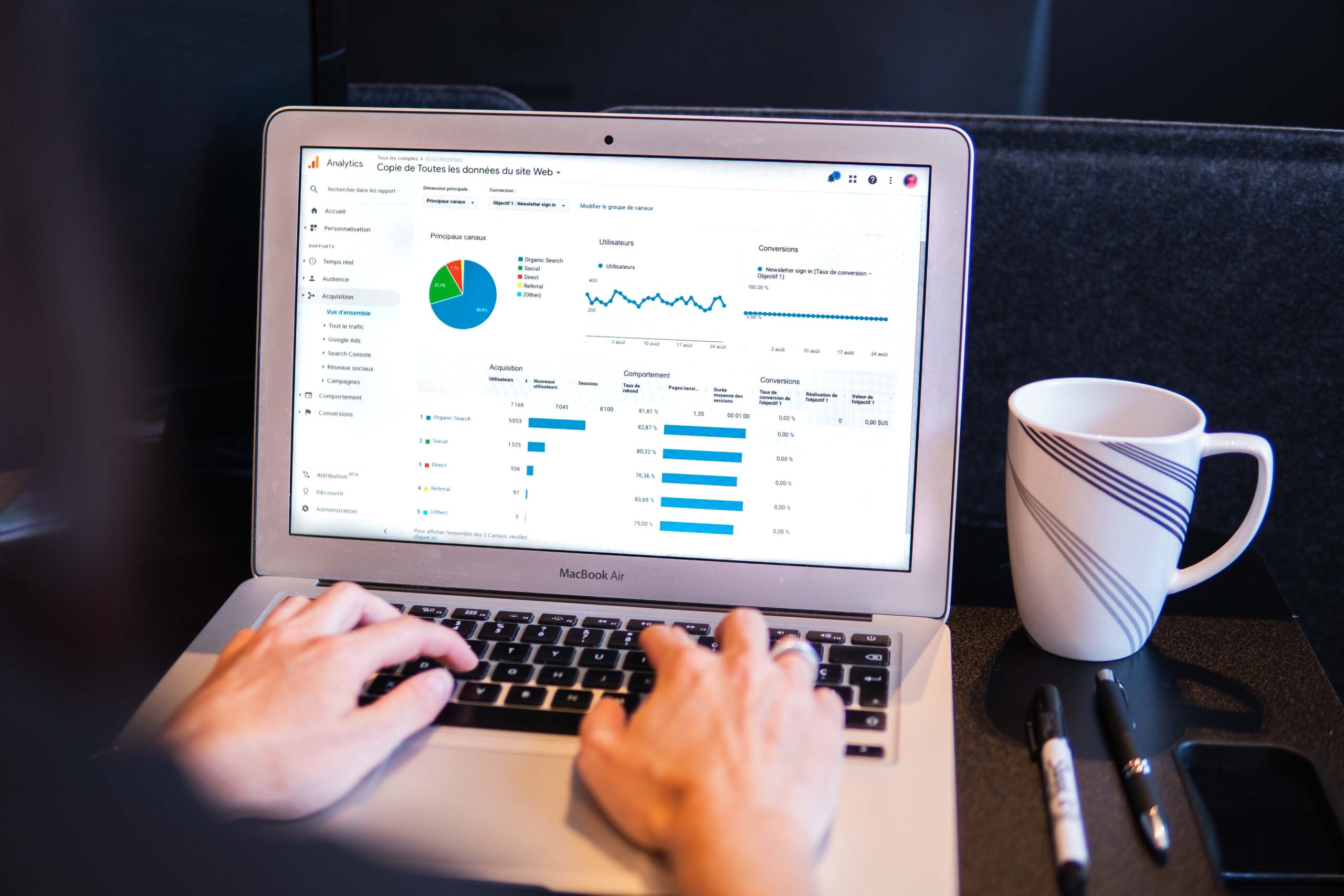
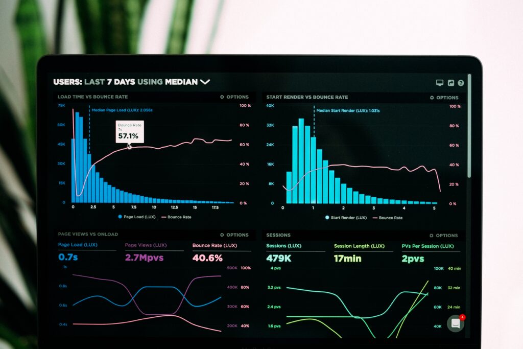
Data visualization is the process of visually representing data. This is typically done by constructing charts, graphs, and maps in order to communicate insights about data to others.
Where data analysis is all about toying with data to find particular patterns, data visualization is the process by which those insights are communicated to others.
What is Data Visualization Used For?
Data professionals have a tough job. They parse through huge volumes of data in order to find trends and patterns, communicate those findings, and, in doing so, influence the way industries run. The tough part comes in communication – not all stakeholders understand the complexity and jargon around data.
Presenting data in a visual context makes it easier for people to understand and utilize the key insights or patterns in the data. These techniques are widely used in education, computer science, entertainment, and business.
Companies like Netflix, for example, use data analysis to identify the optimal time to launch shows and ad campaigns. Their data analysts collect information on user behavior and preferences in order to determine when their target audience is most likely to engage with their content.
This analysis is then presented in data visualizations that highlight trends and patterns. These visualizations not only help stakeholders understand the insights, but also enable them to make informed decisions based on the data.
A great example of data visualization in action is the website Information Is Beautiful. Their main goal is to create impactful infographics and data visuals about timely topics, from environmental issues all the way through to movie statistics. Just by clicking around on their website, you can see how impactful data visualization can be when done right. It’s the best way to make complex information accessible to more people.
Data Visualization Tools
Data analysis and data visualization work together to give a complete picture of data that companies collect from their consumers. While data visualization can help people better understand the results of data analysis, they cannot replace the analytical process itself.
Some examples of data visualization include:
- Charts: These are commonly used to show trends, compare data sets, and track performance.
- Graphs: They are used to show relationships between different data points.
- Maps: Maps are used to visualize data that is spatially related, like the distribution of crime in a city.
- Infographics: This type of visualization combines text, images, and charts in order to tell a story. They are often used to communicate complex data in a way that is easy to understand.
In order to build these visualizations, there are many tools available, each with their own strengths and weaknesses. Choosing the right data visualization tool for the project you are working on depends on the type of data you want to visualize, the level of interactivity you need, the project budget, and your own technical skills.
Some of these data visualization tools include:
- Tableau: This popular data visualization tool is used by businesses, governments, and nonprofit organizations. With Tableau, you can create interactive dashboards and visualizations that can be easily shared with others to communicate complex information simply.
- Qlik Sense: This tool is known best for its speed and flexibility. It allows users to create custom visualizations that can be embedded into websites and applications.
- Power BI: As part of the Microsoft Office suite, this visualization tool connects users to a variety of data sources to create interactive dashboards and reports.
- Google Charts: With Google Charts, users can create a variety of charts and crafts, including bar graphs, line graphs, and pie charts. The best part is that it is available for free online.
- Matplotlib: This Python library allows users to create a variety of charts and graphs, including line graphs, bar graphs, and scatter plots.
Data Visualization Creates Value
The most obvious value of visualizing data is in clearly communicating the patterns and trends analysts find in complex data. In a business setting, this proves very helpful for marketing or production perspectives.
With obvious patterns emerging from consumer data, the marketing team can better understand which campaigns were successful over others. Additionally, the production team can have a better idea of who is buying what products, to help determine the amount to anticipate making in future.
By tracking sales data and identifying trends, companies can make better decisions about pricing, marketing, and overall product development. This also helps companies generate new ideas by using data to think creatively about their product and their customers.
In the case of companies like Information Is Beautiful, creating striking visualizations helps businesses, governments, and nonprofits share their data insights with the public. This can help bring attention to important issues or explain complex ideas to the public.
Data Analysis Methods
Both data analysis and data visualization help people make sense of data. They each do so using vastly different methods with different overall goals. While data visualization is the graphical representation of data, data analysis is a more systematic approach to extracting insights from data.
To better understand what we mean, here are 5 different types of data analysis:
- Descriptive analysis is like taking a snapshot of data. This is often the first step in data analysis, where you can describe what the data is and identify the patterns in it that can inform the next steps of analysis.
- Diagnostic analysis can be compared to a medical diagnosis. By taking a look at data carefully, you can identify the causes of a problem by understanding the factors that contribute to an undesirable outcome.
- Predictive analysis is all about looking into the future. By using statistical models, you can identify patterns in data that can be used to make predictions about customer behavior, sales, risk, and other outcomes.
- Prescriptive analysis is like getting a prescription. Using statistical analysis, you can determine the best course of action for your business based on that data. This is often used to influence decision-making, pricing, marketing, and product development.
- Exploratory analysis is about discovery. By looking at data through different lenses, you can identify patterns and trends that aren’t immediately obvious. This often helps analysts identify key features of data and inform the next steps of analysis.
Data Analysis Creates Value
By analyzing data, analysts can help businesses understand their customers better. They parse through the large data sets to identify trends and make suggestions about pricing, marketing, and product development overall. They also use these insights to identify new markets, develop new products, and create opportunities for businesses overall.
In industries like healthcare, finance, and government, data analysts use their skills to identify and solve problems. From mapping outbreaks to understanding demographic trends in politics, analyzing data can have huge impacts.
In today’s data-driven world, data analysts are in high demand. As the world continues to rely more and more on data, their skills will only become more valuable. To take advantage of this growing industry, learning data analysis in courses like ALX Global’s Data Analytics program is a great way to stay ahead of the curve.

Summary
Data analysis and data visualization are essential tools for making sense of all of the data generated in today’s data-driven world. By combining these two techniques, businesses can gain insights that would be difficult to obtain with just the raw data alone.
When used together, data analysis and data visualization can be a powerful force for businesses. By using data analysis to find insights and the power of visualization to communicate those findings, businesses can make better decisions, solve problems, and identify new opportunities.
If you are interested in learning more about data analysis and data visualization, check out ALX Global’s Data Analytics program. This comprehensive programme will teach you the skills you need to become a proficient data analyst, including data analysis, data visualization, and machine learning.
FAQs
1. What is data visualisation?
Data visualisation is the practice of representing data in visual formats such as charts, graphs, and maps. It simplifies complex information, making it easier to understand and interpret.
By transforming raw data into visual elements, data visualisation enables individuals to identify patterns, trends, and relationships that might not be immediately apparent in raw data.
It plays a crucial role in conveying insights, facilitating data-driven decision-making, and effectively communicating complex data to a wide range of audiences.
2. How do data analysts use data visualisation?
Data analysts use data visualisation to present their findings in a visually appealing and easily understandable format. They leverage various types of charts, graphs, and maps to communicate complex patterns, trends, and insights derived from data analysis. By transforming raw data into visual representations, data analysts can effectively convey their discoveries to stakeholders, decision-makers, and the general public.
Data visualisation allows analysts to highlight key findings, compare datasets, track performance, and identify relationships, enabling informed decision-making and driving actions based on data-driven insights. It serves as a powerful tool to simplify complex information and make data more accessible and actionable for a wide range of audiences.
3. Do data scientists use data visualisation?
Data scientists employ data visualisation as a critical component of their analytical workflow. They utilise visual representations such as charts, graphs, and interactive dashboards to explore and present complex datasets.
Data visualisation enables data scientists to identify patterns, trends, and correlations within the data, making it easier to extract meaningful insights and generate hypotheses. It also facilitates the communication of findings to stakeholders and decision-makers in a visually engaging and intuitive manner.
Leveraging data visualisation, data scientists can effectively communicate their analyses, support data-driven decision-making, and uncover valuable insights that may not be immediately apparent in raw data.